Upswing:Tutoring Platform
Design System
Helping non-traditional students succeed in higher education.
Upswing provides tutoring and other support services to help non-traditional students succeed in higher education. They also provide school administrators with the data they need to increase student retention and graduation rates. As a growing startup, Upswing needed a design system to scale up their Product and Engineering operations.
Overview
UX Team
Katie Yarnold
UX/UI Designer
Duration
6 months
My Role
As the sole UX/UI Designer at Upswing, I built upon the company’s existing components and styling to create an entire design system from the ground up. I collaborated with Engineering, Product, and Marketing teams to ensure that the design system was in line with the company’s development processes and brand guidelines.
Methods
UI / Visual Design
Branding
Systems Design
Interaction Design
Tools
Figma
Sketch
The Problem
Created by a small but passionate team almost 10 years ago, Upswing’s platform was built in a somewhat ad-hoc manner. This led to some UI inconsistencies in color schemes, text styles, layout, padding, etc. Additionally, there was misalignment between Product and Engineering teams when developing new features as there was no single source of truth for the platform’s interface.
At this time, the Product team was transitioning from Sketch to Figma which gave me the opportunity to build a design system to solve these needs. Creating a system of component libraries, styling guidelines, and layout templates would streamline Product processes, create cohesion between Product and Engineering, and improve the end user experience
Accessibility Concerns
Upswing is dedicated to helping ALL students succeed. Accessibility is at the heart of this mission. We needed a platform that was accessible to each and every student, including those with impairments and older students. Unfortunately, the platform’s previous styling included many color combinations that lacked enough contrast to be easily readable for users with visual impairments. As part of this project, I overhauled the platform’s color scheme to ensure that the entire platform meets Web Content Accessibility Guidelines (WCAG) Level AA standards.
Examples of old buttons, not WACG compliant
The Solution
I conducted an audit of the current platform, looking for UI inconsistencies. I found that the platform used a scattered array of colors, as seen in the color swatches below. Many of these light colors were paired with white text despite, making them difficult to read. There were additional inconsistencies in the text styling of headers, the padding on various pages, and the styling of buttons.
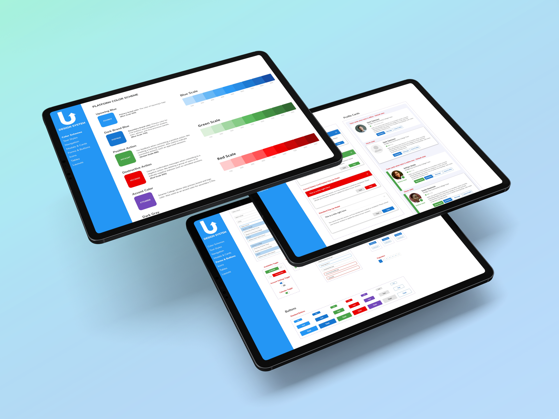
After identifying all of the different UI patterns used throughout the platform, I narrowed these patterns and styling elements down to the most user-friendly elements and UI patterns and recreated those components in Figma. I also used this as an opportunity to make small improvements to our existing components in order to make them more accessible and intuitive, as in the example cards and modals below. Throughout this process, I consulted with the Engineering team to understand which changes would be the least resource-intensive.
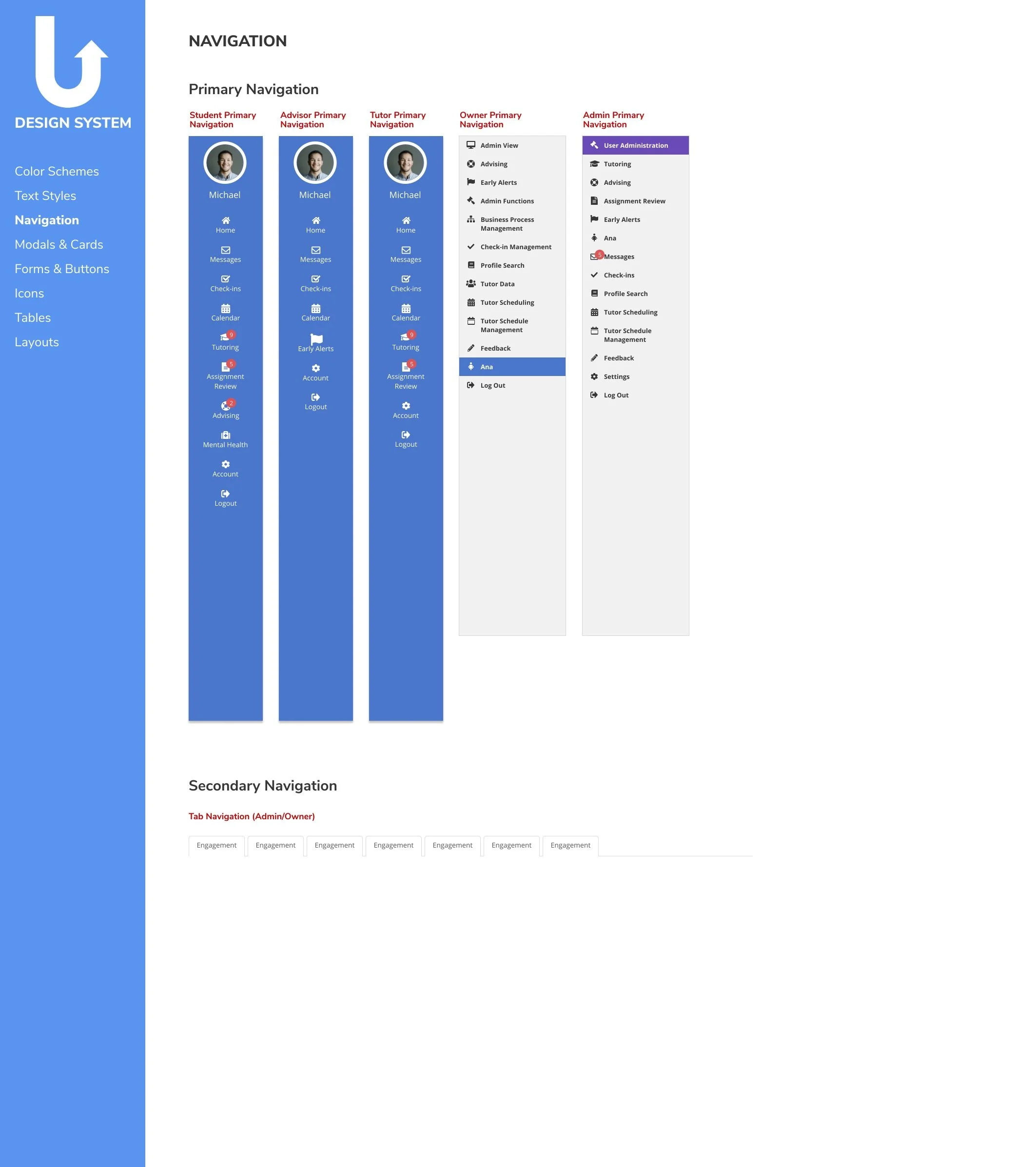
The result was a concise and cohesive design system in Figma which allows the Product team to streamline mockup creation by using the style guide and component library which utilizes Figma’s Variants feature for easy component swapping. This also allows Engineering to easily reference UI guidelines and patterns when developing new features.
A fun inventory of all the colors found on the previous platform. Notice the cumbersome variance in shades.
Interface Improvements
Tutor Profile Cards
Before
Green color not WACG compliant with white text
Blank space when tutor has no rating
All buttons look the same so there’s no clear call to action (CTA)
No use of color = lackluster UI
Color of hover state is difficult to see on the app’s colored background
After
Status dot is a more intuitive indicator of online status
New color is WACG compliant with white text
New hover state is easy to see on colored background
Added minimal color for more engaging UI
Copy informs user why tutor has no rating
Clear call to action button
Before
After
Input Form Modals
Before
After
Before
Green color not WACG compliant with white text
No clear call to action. Too much color makes it unclear which action the user is meant to take
After
Using the brand color in the modal header and CTA button draws the user’s eye to key interface elements and makes the UI more engaging
Clear call to action
New color is WACG compliant with white text


